So,,, my journey of data storytelling begins with visualizing my own data: during the first two weeks in January 2025, I recorded every movie I have watched and visualized this data in two different ways: one focusing on various features of each movie and the other presenting a linear timeline.
In the first version, I designed a clock-like representation where each curve corresponds to a movie. The length of the curve indicates the movie’s duration, while straight lines at both the beginning and end of some curves signify the commuting time when I watched them in a cinema. If I watched a movie with someone, I added a dotted line along the curve. To convey my enjoyment, I used amplitude: larger waves mean I liked the movie more. If it was a rewatch, I marked every corner of the curve with vertical lines. Additionally, I incorporated colors to distinguish different origins—yellow for European films, red for Japanese, and blue for American. The placement of these curves follows the movement of a clock, with gaps representing the intervals between my viewing sessions.

Recognizing that this circular format, while visually engaging, might be less clear for understanding, I created a linear timeline version. In this version, I maintained the same symbolic system but stream-lined the design. All movie times are represented in blue, with some extra red curves indicating time I spent with short videos. I only differentiated types between English and non-English films using dark and light blue. To distinguish where I watched each movie, I used [ ] for cinema viewings and plain for home viewings, while doted lines and curves with vertical lines still follow the previous logic.
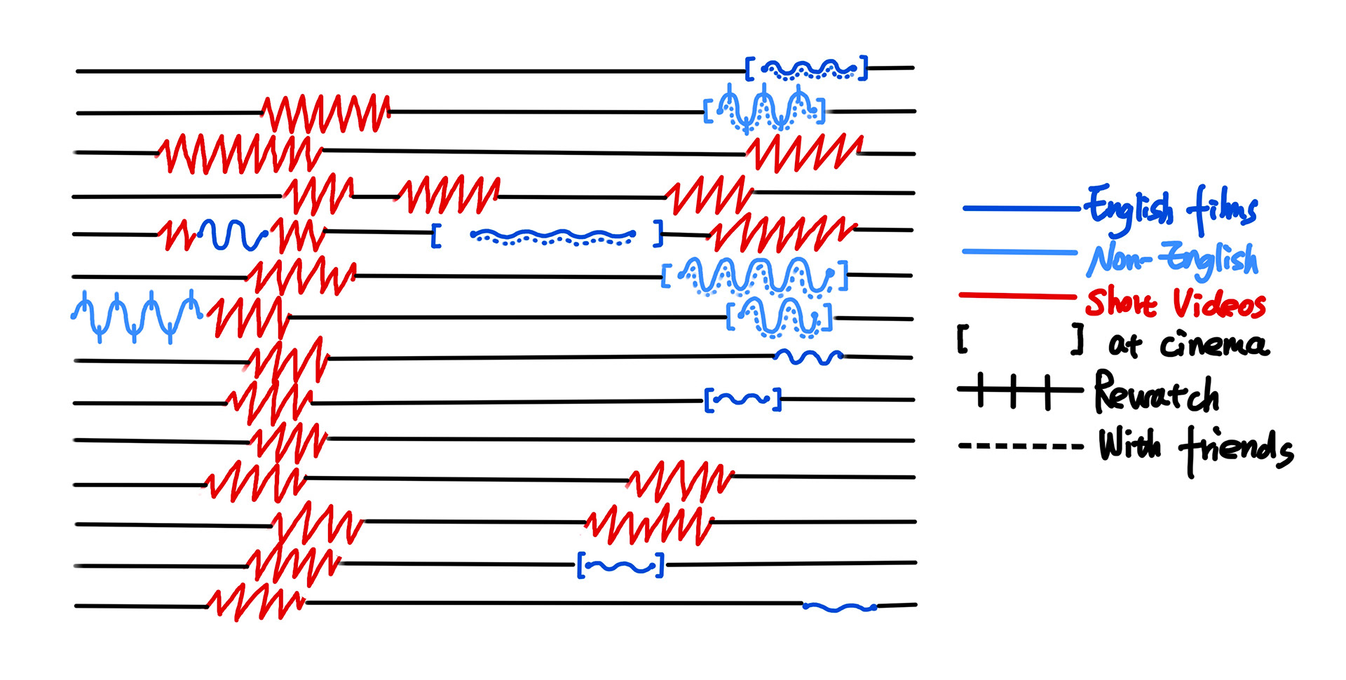
Through these visualizations, I gained insights into my watching habits—such as my preference for certain types of films, how frequently I rewatch movies, and how my viewing patterns fluctuate over time. These drawings transform raw data into an intuitive representation, allowing me to see patterns that might otherwise go unnoticed.
So, I continue to make more data stories...